
The Glow-Up Process (aka how the magic happened)
I reviewed the app's core UX and marketing messaging, aligning it with TCL's elevated tone and aesthetic. From there, the process looked like this:
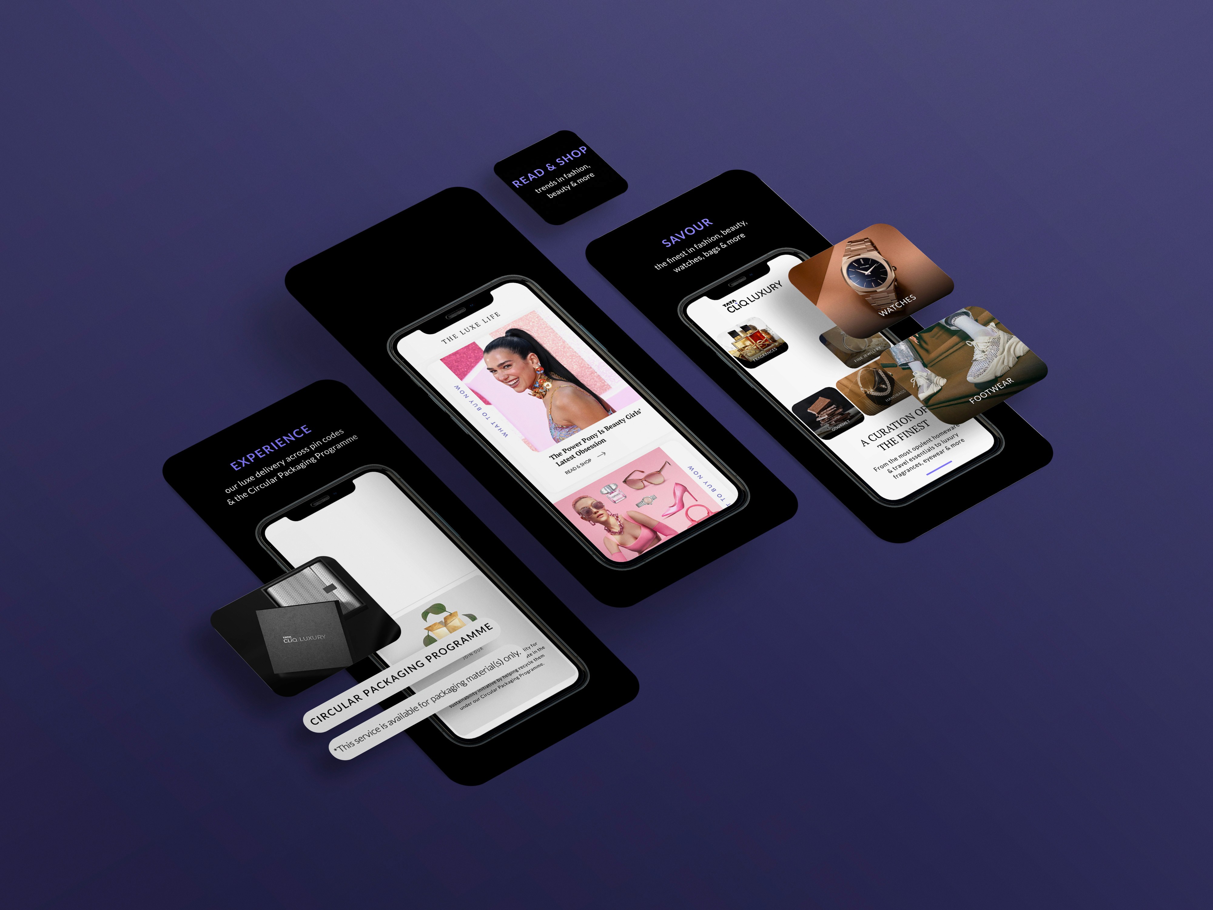
Visual Direction: Developed a clean, premium visual style that reflected the brand's luxe appeal without feeling cluttered or cliché.
Content Flow & Hierarchy: Structured each screen to highlight features like curated collections, seamless navigation, and an elite shopping experience.
Typography & Imagery: Used refined type choices and high-res editorial visuals to mirror the app's premium feel. Every detail was intentional — from spacing to icon size.
Testing + Feedback: Worked closely with the product and marketing teams to refine iterations and ensure the designs were platform-compliant and brand-perfect.
The Results Are Resulting
Delivered a polished set of App Store visuals that made the TCL Luxury app feel just as elevated as the products it offers
Helped increase visual cohesion across platforms — and contributed to a 15% lift in brand consistency scores (internal survey)
Created a consistent first impression that resonated with high-end digital shoppers — resulting in a 35% increase in App Store page clicks
And yes, it made people tap “Get” — app downloads grew 15% in the first-month post-launch


